Ever wonder what the difference between mobile and desktop pagespeeds is? It can be frustrating trying to get mobile site speed scores up to where desktop scores are, and knowing the difference can be helpful.
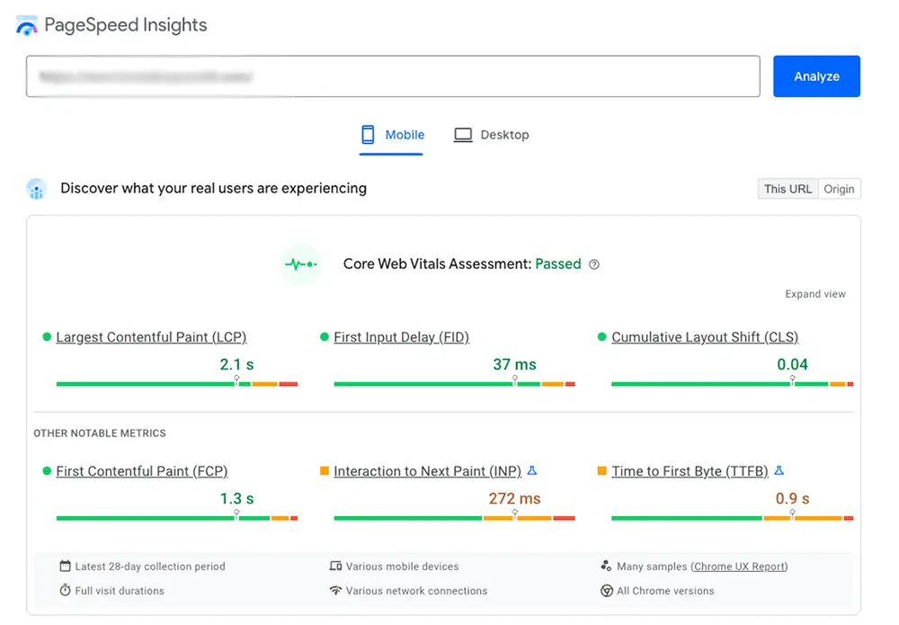
As most publishers know, you can plug any page of your website into Pagespeed Insights and see both your mobile and desktop speeds and suggestions on how to improve. It will give you your page speed and also your site’s Core Web Vitals (CWV). Core Web Vitals can be broken down into three metrics: Largest Contentful Paint (LCP), First Input Delay (FIP), and Cumulative Layout Shift (CLS).
LCP: the time it takes to render the largest content element within the viewport
FIP: measures the time it takes from the user’s first interaction with your page to the time when the browser responds to the interaction
CLS: measures how much items on the page shift while loading
For most websites, mobile scores lower than desktop for Core Web Vitals and for general pagespeed (unless the mobile phone is using wifi; then the pagespeeds should be similar). So why is this?
There are three main factors that make mobile pagespeeds different from desktop pagespeeds:
Mobile devices typically have slower processors
PageSpeed Insights stimulates the cell network at a slower speed
Mobile devices have specific CSS rules
There is nothing we can do about mobile devices having slower processing speeds; until technology gets better, this will just be a part of site speed we all have to live with.
However, Pagespeed Insights, by default, shows the mobile version of the site loading over a simulated 3G connection. You can use Google Lighthouse auditing to do “simulated throttling” to see the initial site speed on a fast connection. From there, Google Lighthouse then can estimate how fast the page would load on a different connection.
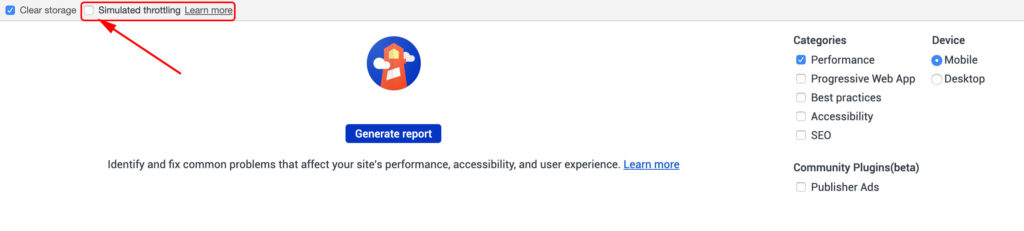
If using Google Lighthouse, it’s important to note that you should use an incognito browser, as private browsers don’t account for extensions. This is not true for Pagespeed Insights, however.
Regarding CSS on mobile, mobile devices often have more device-specific rules about re-sizing; this is why mobile sites often re-size images in the browser. Additionally, more CSS rules are needed on mobile sites, which will slow down the site more.
Ezoic Leap is the premiere tool to use to improve site speed and CWV scores. Leap allows publishers to work on and tweak site speed settings to make their site faster, and the tool is completely free. You can also see what settings other publishers are using so you can learn from them and improve your site.
